As you already know, points in the plane can be labeled by ordered pairs of real numbers. As you also already know, the graph of a function
\(f\) is the set points in the plane corresponding to the ordered pairs
\(\{ (x , f(x)) : x \in
\text{domain of } f \}\text{.}\)
Often the graph of a function is a continuous curve, and can be quickly drawn, conveying essential information about
\(f\) to the eye much more efficiently than if the reader had to wade through equations or set notation.
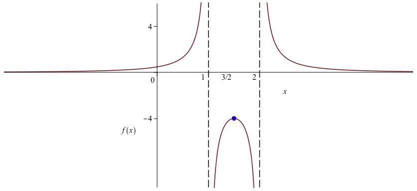
Some conventions make graphs even more effective at conveying information. The axes should be labeled (more on that later) but more importantly, marked so that the scale is clear. Rather than just mark where 1 is on the horizontal and vertical axes, it is often helpful to mark any value where something interesting is going on: a discontuity, an asymptote, a maximum, or a change of cases for functions defined in cases. For example, if we graph
\(x \mapsto 1 / (x^2 - 3x + 2)\text{,}\) we should mark vertical asymptotes (a certain kind of discontinuity) on the
\(x\)-axis at
\(x=1\) and
\(x=2\text{;}\) a dashed vertical line is customary. We should mark a local maximum of
\(-4\) (marked on the
\(y\)-axis) occuring at
\(x = 3/2\) (marked on the
\(x\)-axis). Another way to do this would be to label and mark the point
\((3/2 , -4)\) on the graph. There is a horizontal asymptote at zero, which we would mark with a dashed horizontal line if it occurred anywhere else, but we don’t because it is hidden by the
\(x\)-axis. When graphing a function on the entire real line, we can’t go to infinity and stay in scale, so we either go out of scale or draw a finite portion, large enough to give the idea. Choosing the latter, the resulting picture should look something like the graph in
Figure 0.11.
Here follows a list of tips on graphing an unfamiliar function, call it
\(f\text{.}\) The last three tips on shifting and scaling are ones we have found in the past that many students vaguely recall but get wrong, so please make sure you know them.